Summary

APEX Gantt Chart

View your project time schedule in Gantt format with the APEX Gantt chart visual. Easily import your data from Primavera P6® or Microsoft Project® and build and customize the Gantt Chart to share it with project stakeholders. APEX Gantt offers outstanding features such as comparing up to three versions of the project schedules in Gantt view, dynamic data date, flexible timeline and many more.
Key Features

Unlimited levels of activities

Display activities based on the project WBS with no limit on the number of levels

Milestones

Start and finish milestones are determined automatically

Baselines

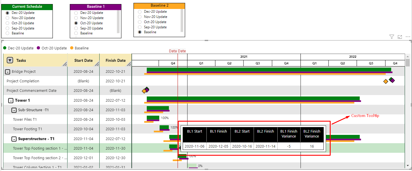
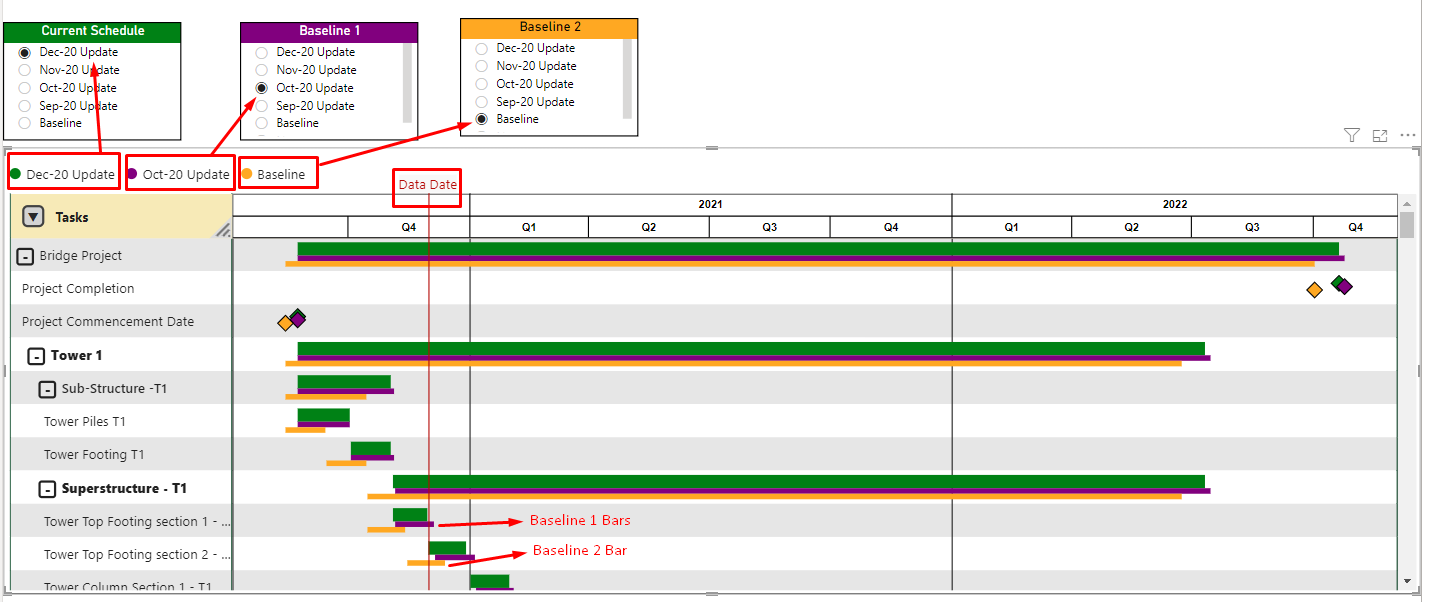
Display up to two baselines with the current schedule

Gantt Chart formatting

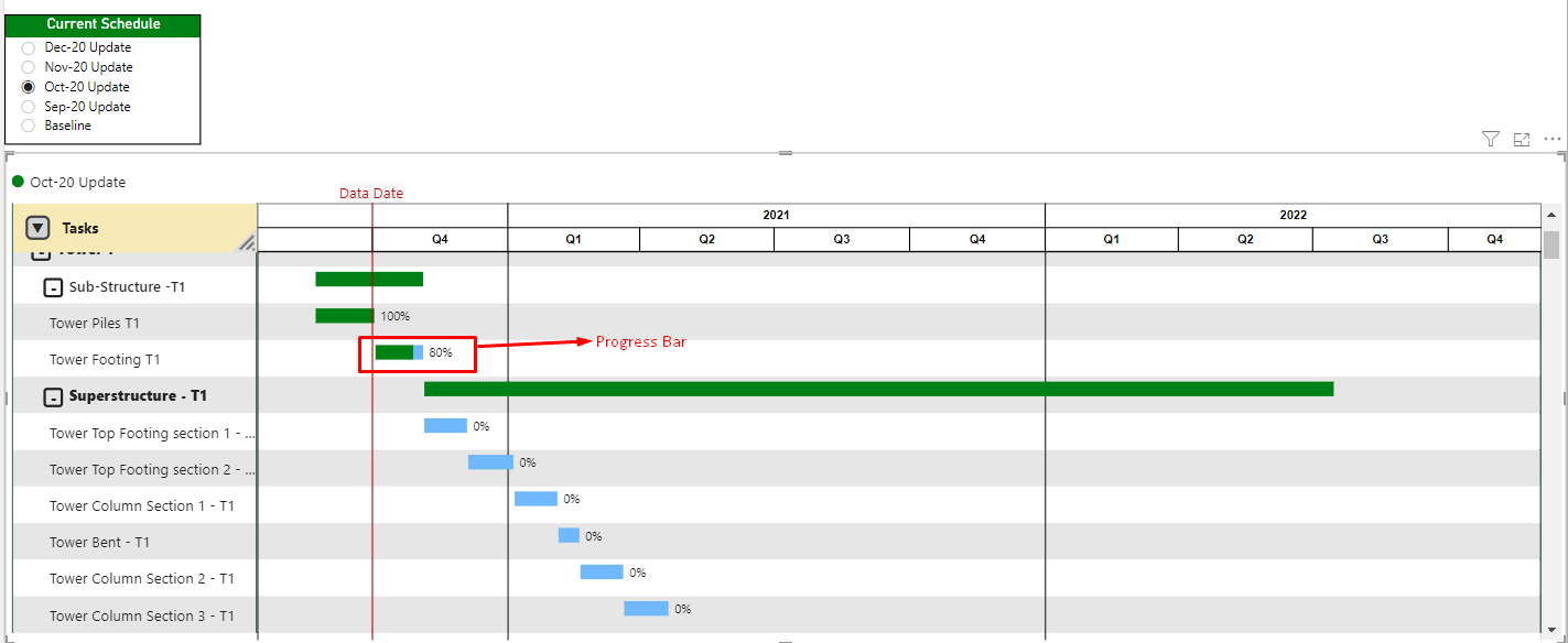
Customize gridlines, use dynamic data date, progress bar and custom tooltips

Customizable formatting and legend

Define different colors for activities, milestones and legend

Performance

Displaying an unlimited number of project tasks without affecting the visual performance

Additional Columns

Add columns for Start, Finish or Progress beside the Gantt Chart

Multiple Timelines

Define three (3) timeline levels e.g. year, quarter, month, week, etc.

Video Tutorial

You can find a short video covering our visual’s functions and features.
Play Video

Purchasing

Download the free trial or purchase the APEX Gantt chart directly from Microsoft

FAQ

This custom visual developed by APEX Project Management Inc. can be used inside Power BI to develop dashboards or reports that gives your teams a visual overview of project schedule and task management. It can illustrate task progression and milestones on multiple levels.

Here is an introductory video that explain the visual capabilities and features:

APEX PM Gantt Chart Visual - YouTube

No unnecessary pre-assumptions or limitations are inherent in the visual representation. While some limitations exist within the Power BI ecosystem and other software, the development process is overseen by highly experienced project management professionals. Numerous features are directly implemented with adaptation to real-world workflows, fostering assurance that this Gantt chart visual is the most pertinent one in the market.

You can delve into the capabilities and attributes of this visual by accessing a sample Power BI report file, available for download on Microsoft AppSource at Business Apps – Microsoft AppSource

This package includes a one-month free trial, allowing you to thoroughly test its features with your own data at no cost.

In the sample file, you'll find a page titled 'Hints' that offers comprehensive guidance and assistance to help you unlock the visual's full capabilities.

Microsoft oversees and manages the licensing process.

You can effortlessly generate your desired project schedules with the APEX Gantt Chart visual by directly exporting data from scheduling software such as Primavera P6 or Microsoft Project or connecting to this software databases. In most cases, there is no need for specific data preparation steps, except for WBS flattening, which is explained in the following video:

How to flatten WBS levels in Power BI - YouTube

Within the visual, there are verification processes in place to expedite the completion of your tasks as quickly as practicable.

The majority of visual elements are only rendered when they are required to be displayed. Extensive testing was conducted with substantial data feeds, and the visual demonstrated almost instantaneous performance, thanks to the efficient lazy calculation and rendering method it employs.

Yes, and thanks to this feature, you can mix the full power of DAX into your visual.

The APEX PM Gantt Chart visual provides a wide array of customization options through the formatting pane. These options empower users to personalize the chart's look to align with their unique requirements and preferences. You can adjust properties related to the timeline, gridlines, task and additional columns, data date line, colors, fonts, and more. Additionally, you have the flexibility to define tooltips and modify the appearance of legends. With numerous choices available, you can not only alter the visual's aesthetics but also enhance its functionality to suit your needs.

Certainly! Indeed, one of the fantastic features of this visual is the ability to seamlessly integrate two baseline bars from two distinct schedules into your project timeline. This enables you to effortlessly compare them within a single, unified view.

You can see the pricing list here:

Business Apps – Microsoft AppSource

If you need any help or assistance, please send us a message via the below link:

Contact – Apex (apexpmapps.com)

We focus on helping organizations with innovative tools and solutions in data analysis.